Tag Archives: illustration

Being discrete

a game of pool - table corner with side lighting

Pool

How do you preserve confidentiality and tell a compelling story? This photo is my answer to that question in a very specific context.

Recently I have been working on a set of photographs for the Levenmouth Foodbank which will be used in a new brochure they are producing. One of the challenges of this project was to illustrate aspects of the work of the Foodbank whilst preserving the confidentially of those who use it. It’s important to be able to tell a story through these kind of images which, for me, fall into the genre of documentary.

Why the need for discretion? It’s probably well known that people who use foodbanks are not doing so through choice but because they have fallen on hard times financially, perhaps temporarily, or perhaps more long term. There is a natural stigma about this and, for the most part, no-one forced to use a foodbank would wish to be recognised as doing so. The trustees and volunteers at the foodbank, quite rightly, also wanted to protect the identity of their clients.

One of the surprising things for me was to find that there is so much more going on at a foodbank than handing out food. I can’t be sure if this applies to all of them, but the Levenmouth Foodbank also runs a café where clients can come in and get a cup of tea or coffee, a hot filled roll and biscuits or, occasionally, some cake. It’s also a social time when clients can meet with each other and chat with Foodbank Volunteers who can guide them with things like budgeting, job seeking etc.

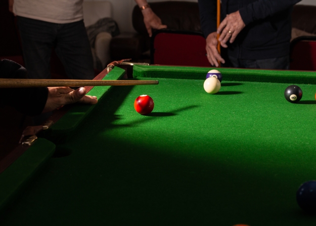
During a shoot at the café I was attracted to the pool table where clients can have a relaxing game with one another or, typically, challenge a volunteer to a game. I wanted to be able to capture this and illustrate the importance of human interaction in a supportive way. I also had to be discrete.

I knew this would need to be a tightly focused shot (and I’m not talking depth of field here) closing in on the detail rather than going wide. The set up for this was pretty simple. I set up my light source (one speed light mounted on a light stand bounced into an umbrella) to the side of the table. I used a wireless trigger to allow me to roam around the table looking for compositions that would work.

The single light source allowed me to create a clear focal point for the image and the shadow cast by the player on the left emphasises the light on the table. I like that the eye is drawn to the action on the table and the cue of the player on the left provides a nice leading line into the composition. It’s obvious that there are two players here and, in the background, there is also one spectator clearly visible. Immediately, there is a sense of what’s going on here without having to reveal any faces.

One of the bonuses for me is that I feel the depth of foreground shadow helps to accentuate the action and perhaps this gives a sense that out of the darkness of despair, there is always the hope of light and better things to come.


The things you do

How do you illustrate an After School Club without using photographs of children doing what they do in the club?

I’m working on a project for a client to provide illustrative photographs for a website redesign and this is a question to which I’ve needed to find an answer. Why? Well, the obvious thing is to take a photo of the club in action but that would require shots of children and for that I’d need to get parental permission for every child in the photograph and that’s a logistical nightmare.

So, to avoid doing the obvious, I decided to ask the basic question: what is it the website needs to convey? Answer: that there is an After School Club. That opened up the opportunity to approach this in a different way. My original idea was to photograph a sign on a school gate and add some graphics to it so I set off in search of something appropriate that would also not identify any specific school. The answer ended up staring me in the face as I drove towards a school:

School street sign

I immediately envisaged a nice tidy crop on this with a graphic treatment that would clearly say there is an After School Club.

This is the end result:

Street sign composite

So how did I get there? Let me take you quickly through the process.

I did some initial work in Lightroom which involved slight adjustments to tone and contrast, lens corrections, straightening and cropping. The rest then happened in Photoshop where I worked with layers.

Photoshop layers

I find it helpful to name the layers so that it’s easier to make sure I am working on the correct one at any given time. As I drove home, it occurred to me that the background would be cluttered and distracting so when I got back I took a shot of the clouds which I intended to use as a background. That became a layer called Background copy (it now occurs to me it would have been easier to call it sky, but there you go; wise after the event).

I made a selection round the sign and used that selection to create a new layer via copy which I called Layer 1 and stacked that above the sky layer. I wanted to create a mixed approach to this graphically so decided that it would be good to have the word “Club” contained in a box like “School”. To do this, I made a careful selection round the “school” lozenge and again created a new layer with that. This one I called lozenge (finally getting down to one word labelling!). That was OK but it still contained the word School so that needed to come out. The easiest way to do this was to make a selection surrounding the word (but not touching the letters) and using the edit menu select fill/content aware. After that it was a simple job of tidying up some loose pixels using the clone stamp tool. Next I created a new text layer and typed the word “Club” which helpfully automatically renamed the layer. I moved that layer to overlap School and adjusted font and size until I had the closest match I could find. Then I moved the Club layer into position below School.

The next step was to create another text layer for After where I used a handwriting font, and free transform to place it just where I felt it had most impact. I was almost there, but two things still troubled me.

If you look at the original image you can see that the pole to which the sign is attached is off-centre. I decided to cut this into a new layer then reposition it centrally. That brought a better balance to the image.

Finally, I felt the sky was just too distracting so applied a gentle blur to make sure all the attention went on the actual sign.

And these, my friends, are the things you do to deliver on a brief.