Absent Traveller

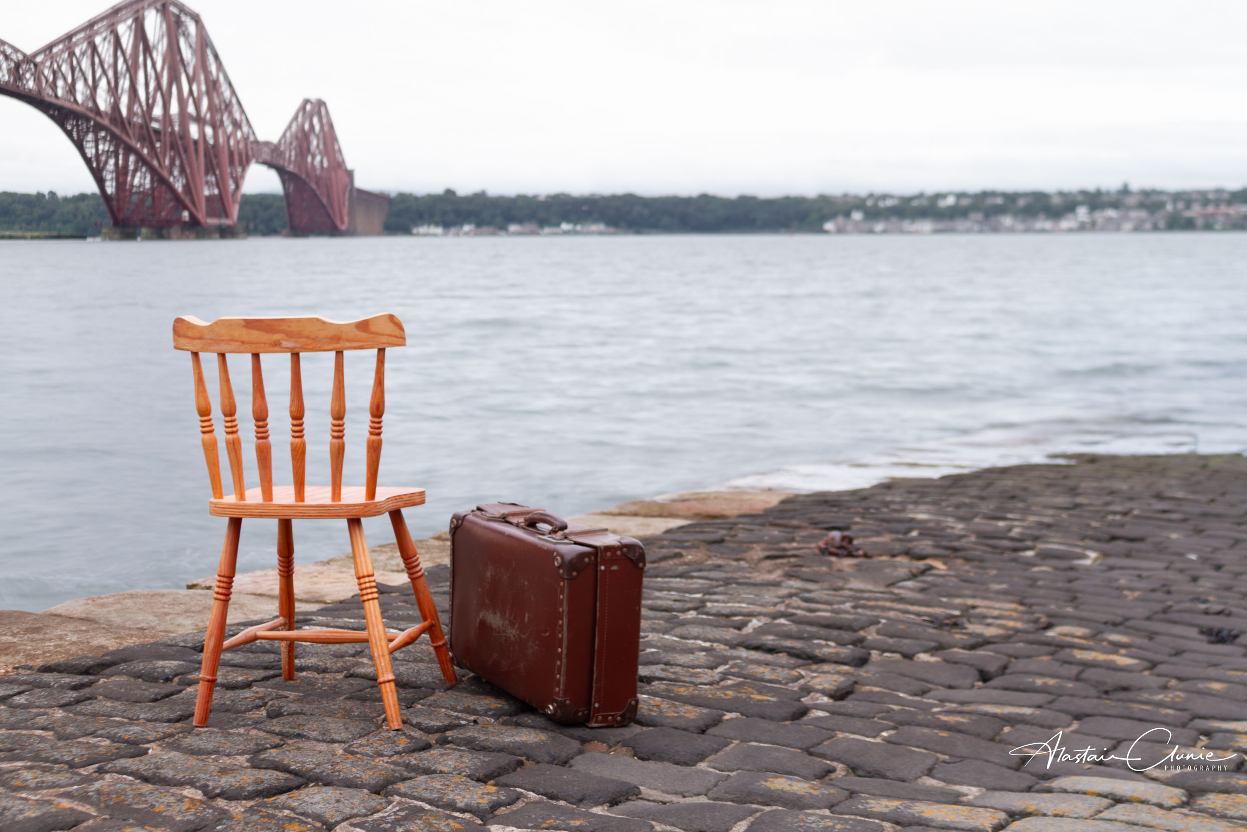
This is the Absent Traveller.

On the 4th of September 1964 the Forth Road Bridge opened and so ended the ferry service which took vehicles and foot passengers across the Forth between South and North Queensferry.

The Absent Traveller is on the old ferry slipway at North Queensferry. It seems as though this traveller is a foot passenger waiting for a ferry that will never now arrive. The suitcase is redolent of a bygone era and the image hints at a nostalgia for a time of less hurried travel. There is within this picture, perhaps, a longing for simpler times when people had time for one another. When passengers on a ferry might pass the time of day with one another during the wait and the crossing. Now people crossing the Forth mostly do so in cars, passing one another at 70mph on the Queensferry Crossing. No time to meet. No time to take an interest in one another. No time to be sociable.

The calm waters awaiting the Absent Traveller suggest a more peaceful time in travelling.

The question is, do we mourn the absence?

Technically, this photo was composed and created to reflect a bygone era of travel. There were some challenges in creating what I had in mind. The location was important to me as I remember, as a boy, using the ferry as we travelled from Edinburgh to Fife to visit my grandparents. I wanted the Forth Bridge in the background as, at the time of the ferries, that was the only bridge crossing the Forth at Queensferry. It’s such an iconic and well-known structure, however, that I needed to make sure it was constrained to the background and did not dominate the composition. To achieve this, I opted to compose the shot with a low angle of view, making the chair and case the dominant subject. I also opted to shoot with a wide aperture (f4) to gain a shallow depth of field and throw the bridge out of focus. That was all fine, but in rendering a look of a bygone time, I wanted the photo to look it had been taken many years ago. To do this, one of the things I wanted to do was to shoot with a longer exposure time – was thinking anything from half to one second. I just wanted a slight softening of the water to reflect the longer exposures of earlier photography. I selected an ISO of 100, but even in the early light just after sunrise I still needed to use an ND filter to achieve an exposure time of 0.6 seconds.

The rest of the work was done in post where, using a graduated mask in Lightroom (top down), I slightly desaturated, to dim the red paint of the bridge and then using Photoshop, I added a slight Sepia tint to the whole image.

You can see the video of the shoot on my YouTube channel and Fine Art prints of the image are available to buy through my website.

Absent Shopper

This is the Absent Shopper.

The empty chair occupies the space we might expect a person to fill, and the setting reveals the type of person this might be.

This shuttered shop has the look of permanent closure about it and a street artist has painted a mural on the shuttering which talks to the history of this place as a one-time vibrant fishing community.

Is the Absent Shopper waiting forlornly with their shopping basket for this local shop to re-open, or mourning the passing of a more personally connected lifestyle?

The image speaks to me of the slow death of community. Over time small local shops found it harder and harder to compete with supermarkets and out of town retail parks. As the corporate-owned big retailers began to dominate and pursue profit maximisation, so the strangulation of community began. Of course, there’s nothing wrong with making a profit. I run a small business and am acutely aware of the need to earn enough to re-invest and lay up reserves for difficult times. I completely get that. But when profit, and profit alone, becomes the driving force we have to ask at what cost?

The Absent Shopper speaks to me of the unacceptable cost of the loss of community. Where once people met in local shops, built a relationship with one another and with local shopkeepers we now have painted memories.

I am, however, an optimist, and dare to believe that people will waken up to what’s going on and desire once again to live in supportive communities. May the absence be a short one.

You can see the video story of the Absent Sopper on my YouTube channel and it’s also expressed on Facebook and Instagram.

You can purchase a print of the image from my website.

Has stock had its day?

I recently had an interesting conversation with a client who, completely unprompted by me, offered the observation that, in his opinion, stock images have had their day.

This was interesting, so I asked why. His observation was that stock images were easy to source, relatively cheap, good quality and easy to use on websites and other media both screen and printed. He was happy to use stock images until one day he found competitors and others using exactly the same images, so he felt that he wasn’t standing out from the crowd. In communication terms, it’s perhaps a bit like shouting in the dicso! To be heard above the general noise you end up just being louder and adding to the overall cacophony. Better to get out and be distinctive.

And that’s where I come in as a professional commercial photographer, aiming to uniquely communicate the values and distinctiveness of the client’s business through creatively bespoke images. Yes, it’s more expensive than using stock images, but it gets you out of the noise.

Now, I must admit, I have in the past contributed to stock sites and have often said that there’s a place for using stock images.

So, why did I stop contributing to stock sites and do I still think stock images have a place in the mix?

Contributing to stock – there are two main reasons I stopped contributing. First of all, as a contributing photographer there are a bunch of rules that you need to keep to. For example, images that contain objects which carry brand identities are rejected. You therefore need to navigate your way through all of these rules to find what is and isn’t acceptable. You’re also contributing to an already huge catalogue of images from which people are selecting. So, to be selected you need to stand out from the crowd somehow, whilst also offering an image that is generic enough to be selected. Because it is such a crowded marketplace, you need a high volume of images in there to have a chance of having any used. Consequently, it tends to be very time consuming for very little reward.

Using stock – do I still think that stock images have a place in the mix, or do I agree with my client that it’s had it’s day?

If the main purpose of using stock is to communicate your business, then I would need to agree with my client. Stock offers generic images which are not going to accurately communicate the reality of your business, let alone convey it’s unique qualities and values.

There may, however, be times when something needs to be illustrated as a general principle or whatever and that’s where stock can come in handy. For example, you might be writing a piece about the value of meetings and here, a well-chosen stock image can serve to break up the text and provide a good illustration. It’s not, in that context, trying to say anything specific about the business.

My own conclusion, therefore, is that if you want to get away from shouting in the disco and communicate the unique values of your business, then use a professional who will work creatively with you to produce high quality images that express what or who your business uniquely is.

Being a creative collaborator

As a commercial photographer I like to work with SME business clients as a creative collaborator helping them make the greatest impact with their visual communication.

Typically clients hire me when they are working on refreshing their website or creating a new one. Sometimes, though not always, they are considering printed media. My advice is always to think of all media and to appreciate that it’s the images which engage people most immediately. To put it another way, they won’t read the words if they’re not captivated by the pictures. Also, pictures communicate at an emotional level and have no language barriers.

So, what does it mean to be a creative collaborator?

Let’s look at the two key words here:

Creative – this is something I aim to bring to the relationship with the client. In part it’s concerned with finding creative and imaginative ways to tell a visual story and to present subject matter. That could be anything from business portraits to product shots. It will involve considerations such as composition and lighting.

Collaborator – this recognises that the relationship with the client is a partnership. Whilst I aim to bring creativity, the client typically has an idea of how they want themselves, their products or services and their business presented.

By way of example, here are some photographs from a shoot with a client whose business is bespoke picture framing.

These are only a sample of the photographs from the shoot, but hopefully illustrate the story of the business: hand crafted, skilled bespoke picture framing showing work in progress, detail, mount options and a finished product.

A pleasant change

As a commercial photographer, I spend most of my time working creatively with businesses to visually represent their brand values through photographs for use in their websites and publicity material. Subjects range from business portraits, to illustrative shots and products of all sorts.

Now that we are again in pretty much a full lockdown, business is really limited to small scale product shoots that I can do at home but this also provides the opportunity to indulge in some local landscape photography – observing all the guidance, of course – and it makes a pleasant change.

On Saturday morning I was up early(ish) to head to the beach with the aim of getting a photograph of the sun rising over the Firth of Forth. It was bitterly cold and one of the key pieces of equipment was the flask of freshly brewed coffee.

I had checked that sunrise was due at 08:45 and was at the location a good 30 minutes ahead of time. This gave me time to set up and also to take a few shots of the growing light before the sun rose over the horizon. The shot above was taken in this half hour before sunrise.

I’m not a landscape specialist but I think this is a genre every photographer enjoys, even if only for fun.

I set up on a tripod so that I had a fixed view which might allow for an interesting series as the sun rose. I opted for using aperture priority on ISO 100 setting the aperture to f11. I took a total of 32 shots in the set and the following is my favourite of the full disc of the sun being over the horizon.

This particular shot was at an exposure time of 1/125 sec. I had considered using an ND filter to achieve a long exposure and soften the water but decided against this for three reasons:

  • I think long exposures work best when there is a clearly defined solid subject in the frame
  • The time of the exposure would result in a tracking effect on the sun (unless I did a blending job in Photoshop)
  • My hands were cold and I couldn’t be bothered fiddling about with filters

In the end, I prefer that there is some detail in the waves which I feel adds interest to the shot.

I doubt this would win any prizes in a landscapes competition, but that’s not the point. It was a refreshing experience to step into a different genre and I got a lot of pleasure from taking the photo and working differently. I also happen to like the end result, which is a bonus.

I should say there’s minimal post-production work on this photo. It was all done in Lightroom and consisted mostly of lens correction, and slight tonal adjustments.

It was indeed a pleasant change, and something I plan to do more of.

The trouble with white and e-commerce

If you sell items on eBay or on your own online shop, you probably want to have them showing on a white background. If you’ve tried to photograph a product on a white background it might be that you’ve experienced the shock that white isn’t white. In other words, you find that the background you thought was white appears not to be in your photo.

I’m going to explain what’s going on and how we achieve that pure white background.

Let’s do it with an example using a vase.

Perhaps you’ve got yourself a nice seamless paper backdrop and set up something like this:

Then you take your photograph with the onboard flash of the camera or a camera-mounted flash, which is exactly what I did, and this is the result:

As you can see, the vase is nicely exposed but the white background is a muddy grey at the top with a hint of blue at the bottom. Anything but white.

What’s happening here, is that the camera and flash, on auto settings, have done their job and correctly exposed for the subject, not for the background. Essentially there’s enough light on the subject but not enough on the background. We also have a rather unsatisfactory shadow cast by the vase onto the background. So, how do we get the vase properly exposed and have the background white?

The answer is that, as a rule of thumb, we want twice as much light on the background as on the subject. Achieving this needs the right equipment and knowledge.

In this example, I retained the on-camera flash for lighting the vase and kept the exposure settings the same. That way I knew I would be properly exposing the vase. Then I added in two studio flashes to the sides in order to light the background as shown in this diagram:

Here, you can see the two flashes to each side. It’s important that they are directed at the background and not spilling light onto the subject.

The flashes are triggered remotely from the camera and their power output is adjustable. I began at roughly twice the power of the flash on the  camera then made some adjustments taking further shots until I was happy with what I got.

Here’s the result straight out the camera as it appears in Lightroom (the editing software I use)

It’s much better but you can see a bluish tinge to the bottom of the photo so more work needs to be done in editing.

Using the brush tool, I increased the values for white and highlights and gently brushed round the background area of the photo.

Here’s a before and after comparison:

And here is the final image after processing

Ah, now that’s much better! It’s also the reason it’s good to get a professional to take your product shots.

The joy of landscape

Almost every photographer I know, whatever genre they work in, will say that they enjoy doing landscape photography. I’m a commercial photographer so I spend a lot of time doing everything from head shots (or business portraits, as I prefer to call them), to products, services, interiors and much in between. Most of this is done indoors with artificial lighting.

It’s therefore a joy to get out in the fresh air from time to time to indulge in some landscape photography, working with the natural environment and available light. It makes you think differently and engage in a fresh way with subject, light and equipment.

I’m also fortunate to live in Scotland where you are never too far from wild countryside and blessed with so many visual delights.

Here are a couple of shots, from a location not too far from my home in Fife. This is the Yad waterfall in Maspie Den on the Falkland Estate. I’m grateful to my business associates at Fife Networking, and especially Craig Allan, for encouraging me to post the photos after mentioning Maspie Den in a Zoom meeting this morning. Thanks folks!

Behind you!

No, it’s not pantomime season.

Rather, it’s a reminder to me that it’s always good to have a look behind.

Cattail reed heads

I went out for my daily “walkcercise” yesterday evening instead of the usual time of just after lunch. “Walkcercise” is what I’ve termed my permitted daily outing for exercise during the Covid-19 lockdown restrictions. Natrually, I took a camera with me, on this occasion hoping to see one of the local deer or a heron down by the river. Typically, when I have a camera with me, they were hiding.

I hate to return empty-handed so thought I’d grab a shot of these cattail reed heads as I quite liked the general fluffiness of the look and I thought it might make an interesting tonal study.

Having taken a few shots I set off to continue the walk and within only a few paces had to cross a little wall with steps on both sides. Before going up the steps I stopped to look back and was so pleased I did as the cattails were beautifully backlit by the setting sun.

backlit cattail reedheads

Actually the sun had fallen just below the visible horizon so the light was softer and more diffused creating a wispy almost hazy look. So much more interesting than what I’d just shot and a good reminder of the value of checking the scene behind you.

As I’d been hoping to catch some wildlife my camera was essentially set up for that job. I was using a 55-200mm zoom lens and as such wnated a shutter speed fast enough to eliminate camera shake and an aperture that would allow decent depth of field should I have to shoot fast. I therefore set up at 1/640 at f8 and opted to use auto ISO.

There was minimal editing in Lightroom to adjust for lens distortion and slight tweaks to tone and contrast.

This is one of those images to be seen full from a proper distance; it’s not for pixel-peepers.

soap and beads

Forced to think and see a little differently

What am I doing during this time of lockdown as the world deals with the Coronavirus?

As a professional photographer whose business is currently in hibernation, part of what I am doing is taking the time to practice and learn. To experiment with new techniques and seek inspiration. As a result I am tuning in to some photography channels on YouTube which normally I only have the time to look at occasionally. One of my favourites is Ted Forbes’ channel, The Art of Photography. I discovered there, that he’s started a series of assignments which are very much for this time of lockdown. I just watched his video setting the Available Light Photo Assignment and it certainly inspired me.

The initial assignment is to choose a window and observe it (ideally photograph it) hourly throughout the day to see how the light changes. The idea is that this will allow you to plan when to use the light in different ways. Ted introduced a few photographers as examples including the Czech photographer, Josef Sudek, whose work is a good example of using available light. This image called Glass with Flower is one such example.

My wife and I have been living in a new house for almost three years now and as we plan out the garden we have both been very conscious of how the sun tracks across it. We have a cabin in the garden with a wooden table and there are net curtains on the windows. Today is very overcast so there’s no directional light to speak of and I thought therefore that the cabin might offer an opportunity to experiment with available light. I realised this would be something of a challenge with such diffused light but also thought that the net curtains would add to the diffusion and it would be interesting to see what I could come up with.

It would have to be a still life and whilst I wanted to try to get the feel of Sudek’s style I didn’t want to do a rip-off, so a glass with flower was out of the question. In my business life I do product photography among other things and normally that’s under studio conditions with very controlled lighting, so I thought it might be good to try something out with available light. But what to shoot?

Then in a moment of inspiration, while washing my hands (as we are advised to do regularly) I thought I would photograph the soap. I thought it might be boring just as it stands so I grabbed some glass beads which I thought might add to the compositon and potentially do something interesting with the light.

With props and camera in hand I hot-footed it to the cabin and here’s what I came up with:

soap and beads

It’s no award winner, but that’s not the point. It was fascinating to do this and it forced me to think differently about using light compositionally. When you examine Dudek’s still lifes, it’s almost light itself that is the subject. I wanted to achieve as much of the desired effect as possible in camera, but I have to confess this has had post-production in Lightroom and Photoshop. Here are the details:

It was shot hand-held at 1/125 sec at f4 with an ISO of 320 and a focal length of 24mm. This was underexposing from the TTL metering by about 2 stops. It was cropped in Lightroom to a square format (which I intended from the outset) and I also made slight adjustments to contrast and highlights as well as converting to black & white. In Photoshop I added a gentle sepia filter.

Originally I shot the bottle on it’s own then added the glass beads by just scattering them randomly. I really liked the way they picked up the light and behaved a little differently depending on whether they had fallen on the flat side or rounded side.

Having been inspired by the way the beads worked with the light, I decided to make them the subject resulting in this shot:

glass beads

Again, this was hand held and taken on the follwoing settings:

1/160sec at f5.6 on ISO 320 and a focal length of 55mm. This was only cropped in Lightroom with adjustments to contrast and highlights and a black and white conversion.

The I wondered about leaving the beads in colour and having everything else in black and white. Here’s the result of that:

green beads

To get this, I went back to the colour shot and desaturated all the colour channels apart from green and aqua.

I’ve really enjoyed doing this and being forced to think and see a little differently.

Which of the glass beads shots do you prefer? The pure black and white or the green? Let me know in the comments – I’d really appreciate it.

Ted Forbes, I will be back on your channel for more assignments!

What’s that on your desk? Part three

Desk lighting

For this third in the series, “what’s that on your desk?” I want to focus on my desk lighting and actually more generally my office lighting.

The importance of this is for image processing in post produciton and it might be a very a personal thing but, for me it’s important so I thought it worth sharing. More of us photographers whether professional or enthusiast are probably spending more time at our desks on our PCs doing photo editing during the lockdown we are enduring thanks to the Covid-19 pandemic.

So, whether you are revisiting old images to re-work them or learning and practicing new techniques I hope this short post on how I light my room and desk for this will be helpful.

Let’s begin with the “why” question. Why does room lighting matter? We’re not working with film and paper in a darkroom. As I said, it’s probably a personal thing but, for me, it’s important to have a nice clear screen to work on. I need to see the images as clearly as possible so that I know what adjustments I need to make. I therefore don’t want glare or reflections on the screen and I also don’t want colours being affected by ambient light at different colour temperatures affecting the hue of what I’m looking at.

So let’s begin with the office. For reasons I could do nothing about, my desk sits almost directly opposite this window.

office lighting

I could choose to have a total blackout but I like daylight and generally want to work in daylight as much as possible, but then I want it as diffused as possible and I need to prevent light from this window garing on my screen. The answer is vertical blinds but these are solid vanes rather than fabric and only allow light to pass between or around them and not through.

The window is east facing so by having the blinds angled this way direct sunlight is prevented from coming in as the sun tracks westerly – or to the right as we look at this photo. I simply angled the blinds until there was no glare or reflection on my computer screen.

This arrangement lets in a good amount of diffused daylight on a bright sunny day when I might not need any dask lighting at all.

But what about those dull days when some artifical light is required in the room?

So, let’s look again at the photo of my desk set-up.

desk lighting

You can see two lights on my desk. To the top right with a blue shade is an adjustable angle-poise lamp. To the left is a small LED clipped to the top of the desk and directed straight down. Apart from the diffused natural daylight coming from the window, these are pretty much the only lights I work with when editing.

Again, the whole aim is not to pollute the screen with glare or ambient light at a different colour temperature. But whay have lights on the desk at all? For me, I like to be able to clearly see my keyboard and Loupedeck control panel so the desk lighting is primarily for that.

Let’s start with the angle-poise lamp to the top right. As you can see, I have that angled to the wall when I am photo editing. That way the light is bounced off the wall rather than being directional. The bulb in that lamp is also rated as a “daylight” colour temperature (on the bulb anything between 5,000K and 6,500K will do). I tend to find that this set up serves me well.

The LED to the left of the desk is not daylight rated and delivers a warmer clour temperature, so it is used only to illuminate notes or anything else to my left which I need to refer to. It is purposely pointed straight down to minimise interference with the screen and I’ll tend only to switch it on for when it’s absolutely needed.

And that’s it, really, apart from the ceiling light which I never use when editing, but it also is fitted with a daylight rated bulb just in case.