I shot this photo in the pass of Killicrankie, Perthshire, on 11 November and, as usual shot it in RAW. I thought it might be interesting to walk you through the editing I did to get to the final image and I’ll try to explain my reasoning as we go.
Here’s the original shot as it came out of the camera.

Killicrankie
My aim in editing landscape shots like this, is to get as close as possible to how I saw the scene with my own eyes at the time. There are a few standard initial steps I take in my work flow and I always begin in Lightroom. Seldom do I need to use Photoshop, though there are occasions when that’s definitely required.
The first thing I do is go to lens corrections and tick two boxes there: enable profile correction (which compensates for lens distortion) and enable chromatic aberration – I can’t see any chromatic aberration in this shot, but I don’t think ticking this box does any harm, just in case.
Next it’s off to the basic panel and there I could see that there was a nice looking histogram so there’s no need to do anything with the exposure (at least not at this point – sometimes other adjustments have an effect on exposure which later needs a little correction). The histogram looked very like a standard bell curve with nothing bunched at either end, so no blown out highlights or over-cooked blacks. I decided therefore to increase the whites and reduce the blacks to just before the point where clipping occurs – just to see what that did to the image which was too “thin” compared to my memory of the scene. A quick check on before/after showed that this had introduced a little more contrast and enriched the colours a little. Definitely making headway to “thickening it up”.
The next steps were to drop the highlights a touch, just enough to bring the top of the histogram off the top of the scale and no more, and to add a very small amount of dehaze, which helped to add a little sharpening in the mid-tones. Another quick before/after check to make sure I was still headed in the right direction and I was happy to move on and consider what next. I decided to take the vibrance up a fraction, judging the effect by eye, and moved away from the basics panel.
Looking now at the colours, I was happy with the yellows and greens but felt the purple and magenta tones were just a little muted compared to my memory. So to the HSL/colour panel and minor adjustments to the purple and magenta channels. In each of those I pulled back the hue a little to the left (different small amounts on each), and slightly boosted the saturation before reducing the luminance. All these changes are small and subtle but collectively begin to add up – which is a good reason for never being heavy handed in any one element. Another before/after check and we are looking good so far.
I still felt it needed just a little more “depth” so went to the tone curve and set it to medium contrast and checked before/after. Actually, I kept the before/after window open and clicked the tone curve on and off several times just to decide if I wanted to stick with that adjustment or abandon it. I decided to stick with it.
By this time I felt we were almost there but notices that some highlights had blown out so used the adjustment brush to make local changes to the highlights.
I usually have a look at sharpening, and I find that Lightroom does a good enough job with this, though if I was being really fussy I’d probably do this in Photoshop with a high pass. Working in Lightroom, with a shot like this (and don’t take this as a rule, always trust your eyes) I set the sharpening to around 30. The Alt key I drag the masking slider way to the right. This gives a black and white screen and only the white areas are affected by the sharpening. In this case I needed to slide all the way to 99 until I was happy. I aslo reduced the radius slider to 0.5 and the detail slider to 4. Another before/after check and I was happy with how it was now looking. I felt it was now a more accurate representation of how I had seen it and that it wasn’t overcooked in processing. Landscapes on steroids don’t look good – at least that’s my opinion.
The only remaining question for me was one of composition. This entailed just sitting and looking at the image for a while and pondering if there were any distractions that I could/should crop out and also what final crop ratio I would prefer. I wasn’t sure about the evergreens at the top right of frame and, to be honest, As a leading line, I’d have preferred the railway to enter the frame bottom left, but I was hampered by physical location at the time of shooting. So, what followed as a period of trial and error with different crops. I rather liked a wide format 16×9 crop but was still unsettled by the central entrance of the leading line of the railway. Finally I settled on a square crop which allowed me to bring the leading line in from the bottom left of frame and I was happy to leave just a hint of the evergreens top right.
And here is the final result:

Killicrankie
I hope you like it and have maybe found the explanation of how I went from the original “out-of-camera” shot to the final image interesting and perhaps useful.
Thank you for reading and, if you do, for following me. Why not check out my Instagram account and also follow me there.


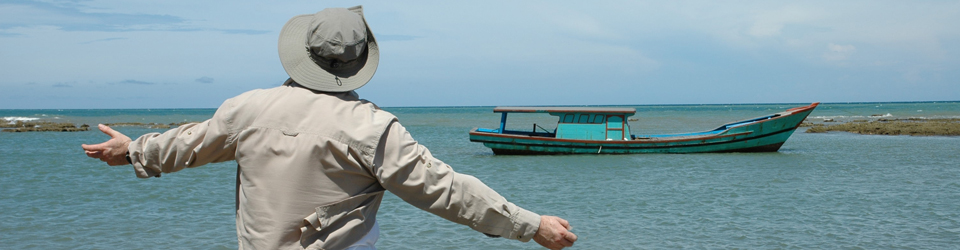
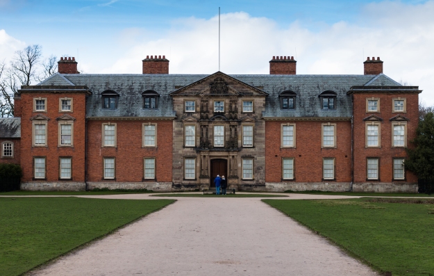 First up is the house itself. Pretty standard fare photographically with a full-frontal square on view of the property, but there’s nothing wrong with that and it gives a good context. Although this was out of season and I waited patiently for there to be no people walking across the shot, it proved impossible and this was the least populated shot I could get. I thought about removing the people in Photoshop but in the end felt that their inclusion added something to the image. This was shot hand held at 1/500 sec at f5 on ISO 200. As ever, I shot in RAW and did my own processing in Lightroom. In addition to the usual light touches I added a graduated filter to decrease the exposure in the sky to balance up the overall image a little more.
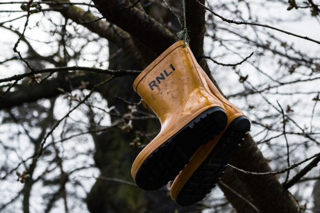 I was particularly taken with these RNLI branded boots hanging in a tree; that’s taking out of context to a whole new level. I decided to focus in quite tightly on the boots but leave enough space to reveal the context, though with a wide aperture to give a shallow depth of field throwing the tree out of focus and concentrating on the boots. This was shot hand held at 1/250 sec at f5.6 on ISO 200. The focal length on the shot was 55mm and this had only the usual light touch processing in Lightroom.
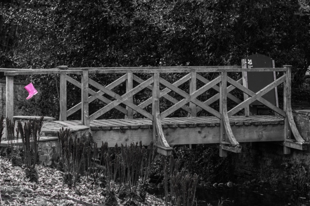 Continuing the welly-boot theme, I spotted this pair hanging from a wooden bridge. At the time of taking the shot I already knew that I wanted to render this in monochrome with the boots retaining their colour, so shot it with that in mind. As there was enough tonal range to clearly depict the bridge in it’s context, I opted for a wider shot to include the whole bridge, knowing that the colour in the boots would make them easily visible in the final image. This was shot hand held at 1/100 sec at f5.6 on ISO 200. To retain the boots in colour I opted to simply desaturate the colours individually as the boots were the only things that colour! That was a simpler approach than going into Photoshop to use layers and masks.
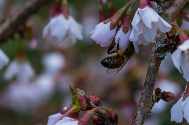 One of the things I like doing is getting in close to some detail. In the garden there was a border of bushes in bloom with small flowers and the obvious thing was to capture them in a wide shot (which I did, eventually) but first I decided to close in on some detail. In doing so I spotted a bee going about it’s business and stuck with it to get the photo above. It’s one of those things that would be so easily missed. This was also shot hand-held at 1/500 sec at f5.6 on an ISO of 200.
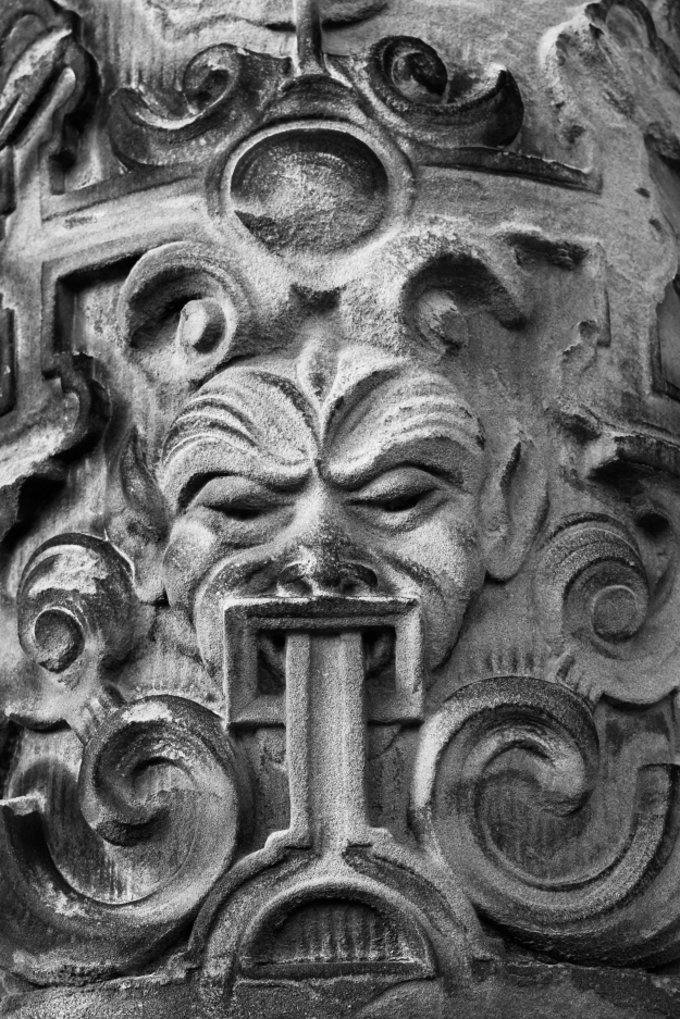 Back at the house I went in close again for this shot of the stonework by the door. I love the feeling of texture in it and opted to convert the image to mono in order to make this more apparent. Again, apart from the mono conversion, there was minimal processing within Lightroom. Although there’s not much physical depth to the subject here, I wanted to make sure everything was in focus, so opted for an aperture of f10. Keeping the ISO at 200, I was able to shoot this at 1/125 sec and given a focal length of 51mm that was easily good enough to be hand-held.
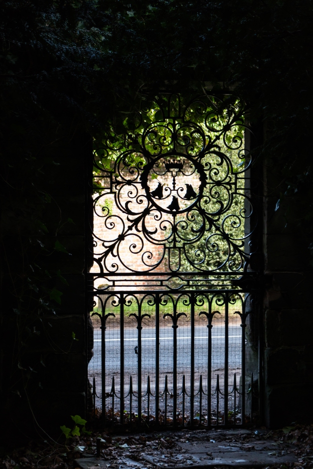 And finally one of my favourite things – using something as a natural frame to gain high contrast. These can be challenging as it’s good to retain some detail in the shadows which adds to the feeling of depth and avoids having a black interestingly shaped border. The challenge is to make sure that the highlights don’t blow out, so I was careful to check the on-camera histogram before deciding I probably had the shot I wanted. There was just enough light spilling into the foliage inside the gate to show up, so I metered for the outside and set my white balance for that too. This was shot at 1/200 sec at f5.6 on an ISO of 640. Within Lightroom I only had to pull back the highights a little to make sure there was detail in the bright areas.

