Category Archives: photography

A pleasant change

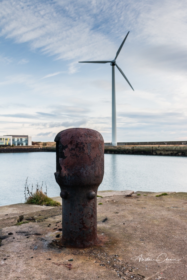
As a commercial photographer, I spend most of my time working creatively with businesses to visually represent their brand values through photographs for use in their websites and publicity material. Subjects range from business portraits, to illustrative shots and products of all sorts.

Now that we are again in pretty much a full lockdown, business is really limited to small scale product shoots that I can do at home but this also provides the opportunity to indulge in some local landscape photography – observing all the guidance, of course – and it makes a pleasant change.

On Saturday morning I was up early(ish) to head to the beach with the aim of getting a photograph of the sun rising over the Firth of Forth. It was bitterly cold and one of the key pieces of equipment was the flask of freshly brewed coffee.

I had checked that sunrise was due at 08:45 and was at the location a good 30 minutes ahead of time. This gave me time to set up and also to take a few shots of the growing light before the sun rose over the horizon. The shot above was taken in this half hour before sunrise.

I’m not a landscape specialist but I think this is a genre every photographer enjoys, even if only for fun.

I set up on a tripod so that I had a fixed view which might allow for an interesting series as the sun rose. I opted for using aperture priority on ISO 100 setting the aperture to f11. I took a total of 32 shots in the set and the following is my favourite of the full disc of the sun being over the horizon.

This particular shot was at an exposure time of 1/125 sec. I had considered using an ND filter to achieve a long exposure and soften the water but decided against this for three reasons:

  • I think long exposures work best when there is a clearly defined solid subject in the frame
  • The time of the exposure would result in a tracking effect on the sun (unless I did a blending job in Photoshop)
  • My hands were cold and I couldn’t be bothered fiddling about with filters

In the end, I prefer that there is some detail in the waves which I feel adds interest to the shot.

I doubt this would win any prizes in a landscapes competition, but that’s not the point. It was a refreshing experience to step into a different genre and I got a lot of pleasure from taking the photo and working differently. I also happen to like the end result, which is a bonus.

I should say there’s minimal post-production work on this photo. It was all done in Lightroom and consisted mostly of lens correction, and slight tonal adjustments.

It was indeed a pleasant change, and something I plan to do more of.

The trouble with white and e-commerce

If you sell items on eBay or on your own online shop, you probably want to have them showing on a white background. If you’ve tried to photograph a product on a white background it might be that you’ve experienced the shock that white isn’t white. In other words, you find that the background you thought was white appears not to be in your photo.

I’m going to explain what’s going on and how we achieve that pure white background.

Let’s do it with an example using a vase.

Perhaps you’ve got yourself a nice seamless paper backdrop and set up something like this:

Then you take your photograph with the onboard flash of the camera or a camera-mounted flash, which is exactly what I did, and this is the result:

As you can see, the vase is nicely exposed but the white background is a muddy grey at the top with a hint of blue at the bottom. Anything but white.

What’s happening here, is that the camera and flash, on auto settings, have done their job and correctly exposed for the subject, not for the background. Essentially there’s enough light on the subject but not enough on the background. We also have a rather unsatisfactory shadow cast by the vase onto the background. So, how do we get the vase properly exposed and have the background white?

The answer is that, as a rule of thumb, we want twice as much light on the background as on the subject. Achieving this needs the right equipment and knowledge.

In this example, I retained the on-camera flash for lighting the vase and kept the exposure settings the same. That way I knew I would be properly exposing the vase. Then I added in two studio flashes to the sides in order to light the background as shown in this diagram:

Here, you can see the two flashes to each side. It’s important that they are directed at the background and not spilling light onto the subject.

The flashes are triggered remotely from the camera and their power output is adjustable. I began at roughly twice the power of the flash on the  camera then made some adjustments taking further shots until I was happy with what I got.

Here’s the result straight out the camera as it appears in Lightroom (the editing software I use)

It’s much better but you can see a bluish tinge to the bottom of the photo so more work needs to be done in editing.

Using the brush tool, I increased the values for white and highlights and gently brushed round the background area of the photo.

Here’s a before and after comparison:

And here is the final image after processing

Ah, now that’s much better! It’s also the reason it’s good to get a professional to take your product shots.

Behind you!

No, it’s not pantomime season.

Rather, it’s a reminder to me that it’s always good to have a look behind.

Cattail reed heads

I went out for my daily “walkcercise” yesterday evening instead of the usual time of just after lunch. “Walkcercise” is what I’ve termed my permitted daily outing for exercise during the Covid-19 lockdown restrictions. Natrually, I took a camera with me, on this occasion hoping to see one of the local deer or a heron down by the river. Typically, when I have a camera with me, they were hiding.

I hate to return empty-handed so thought I’d grab a shot of these cattail reed heads as I quite liked the general fluffiness of the look and I thought it might make an interesting tonal study.

Having taken a few shots I set off to continue the walk and within only a few paces had to cross a little wall with steps on both sides. Before going up the steps I stopped to look back and was so pleased I did as the cattails were beautifully backlit by the setting sun.

backlit cattail reedheads

Actually the sun had fallen just below the visible horizon so the light was softer and more diffused creating a wispy almost hazy look. So much more interesting than what I’d just shot and a good reminder of the value of checking the scene behind you.

As I’d been hoping to catch some wildlife my camera was essentially set up for that job. I was using a 55-200mm zoom lens and as such wnated a shutter speed fast enough to eliminate camera shake and an aperture that would allow decent depth of field should I have to shoot fast. I therefore set up at 1/640 at f8 and opted to use auto ISO.

There was minimal editing in Lightroom to adjust for lens distortion and slight tweaks to tone and contrast.

This is one of those images to be seen full from a proper distance; it’s not for pixel-peepers.

soap and beads

Forced to think and see a little differently

What am I doing during this time of lockdown as the world deals with the Coronavirus?

As a professional photographer whose business is currently in hibernation, part of what I am doing is taking the time to practice and learn. To experiment with new techniques and seek inspiration. As a result I am tuning in to some photography channels on YouTube which normally I only have the time to look at occasionally. One of my favourites is Ted Forbes’ channel, The Art of Photography. I discovered there, that he’s started a series of assignments which are very much for this time of lockdown. I just watched his video setting the Available Light Photo Assignment and it certainly inspired me.

The initial assignment is to choose a window and observe it (ideally photograph it) hourly throughout the day to see how the light changes. The idea is that this will allow you to plan when to use the light in different ways. Ted introduced a few photographers as examples including the Czech photographer, Josef Sudek, whose work is a good example of using available light. This image called Glass with Flower is one such example.

My wife and I have been living in a new house for almost three years now and as we plan out the garden we have both been very conscious of how the sun tracks across it. We have a cabin in the garden with a wooden table and there are net curtains on the windows. Today is very overcast so there’s no directional light to speak of and I thought therefore that the cabin might offer an opportunity to experiment with available light. I realised this would be something of a challenge with such diffused light but also thought that the net curtains would add to the diffusion and it would be interesting to see what I could come up with.

It would have to be a still life and whilst I wanted to try to get the feel of Sudek’s style I didn’t want to do a rip-off, so a glass with flower was out of the question. In my business life I do product photography among other things and normally that’s under studio conditions with very controlled lighting, so I thought it might be good to try something out with available light. But what to shoot?

Then in a moment of inspiration, while washing my hands (as we are advised to do regularly) I thought I would photograph the soap. I thought it might be boring just as it stands so I grabbed some glass beads which I thought might add to the compositon and potentially do something interesting with the light.

With props and camera in hand I hot-footed it to the cabin and here’s what I came up with:

soap and beads

It’s no award winner, but that’s not the point. It was fascinating to do this and it forced me to think differently about using light compositionally. When you examine Dudek’s still lifes, it’s almost light itself that is the subject. I wanted to achieve as much of the desired effect as possible in camera, but I have to confess this has had post-production in Lightroom and Photoshop. Here are the details:

It was shot hand-held at 1/125 sec at f4 with an ISO of 320 and a focal length of 24mm. This was underexposing from the TTL metering by about 2 stops. It was cropped in Lightroom to a square format (which I intended from the outset) and I also made slight adjustments to contrast and highlights as well as converting to black & white. In Photoshop I added a gentle sepia filter.

Originally I shot the bottle on it’s own then added the glass beads by just scattering them randomly. I really liked the way they picked up the light and behaved a little differently depending on whether they had fallen on the flat side or rounded side.

Having been inspired by the way the beads worked with the light, I decided to make them the subject resulting in this shot:

glass beads

Again, this was hand held and taken on the follwoing settings:

1/160sec at f5.6 on ISO 320 and a focal length of 55mm. This was only cropped in Lightroom with adjustments to contrast and highlights and a black and white conversion.

The I wondered about leaving the beads in colour and having everything else in black and white. Here’s the result of that:

green beads

To get this, I went back to the colour shot and desaturated all the colour channels apart from green and aqua.

I’ve really enjoyed doing this and being forced to think and see a little differently.

Which of the glass beads shots do you prefer? The pure black and white or the green? Let me know in the comments – I’d really appreciate it.

Ted Forbes, I will be back on your channel for more assignments!

What’s that on your desk? Part three

Desk lighting

For this third in the series, “what’s that on your desk?” I want to focus on my desk lighting and actually more generally my office lighting.

The importance of this is for image processing in post produciton and it might be a very a personal thing but, for me it’s important so I thought it worth sharing. More of us photographers whether professional or enthusiast are probably spending more time at our desks on our PCs doing photo editing during the lockdown we are enduring thanks to the Covid-19 pandemic.

So, whether you are revisiting old images to re-work them or learning and practicing new techniques I hope this short post on how I light my room and desk for this will be helpful.

Let’s begin with the “why” question. Why does room lighting matter? We’re not working with film and paper in a darkroom. As I said, it’s probably a personal thing but, for me, it’s important to have a nice clear screen to work on. I need to see the images as clearly as possible so that I know what adjustments I need to make. I therefore don’t want glare or reflections on the screen and I also don’t want colours being affected by ambient light at different colour temperatures affecting the hue of what I’m looking at.

So let’s begin with the office. For reasons I could do nothing about, my desk sits almost directly opposite this window.

office lighting

I could choose to have a total blackout but I like daylight and generally want to work in daylight as much as possible, but then I want it as diffused as possible and I need to prevent light from this window garing on my screen. The answer is vertical blinds but these are solid vanes rather than fabric and only allow light to pass between or around them and not through.

The window is east facing so by having the blinds angled this way direct sunlight is prevented from coming in as the sun tracks westerly – or to the right as we look at this photo. I simply angled the blinds until there was no glare or reflection on my computer screen.

This arrangement lets in a good amount of diffused daylight on a bright sunny day when I might not need any dask lighting at all.

But what about those dull days when some artifical light is required in the room?

So, let’s look again at the photo of my desk set-up.

desk lighting

You can see two lights on my desk. To the top right with a blue shade is an adjustable angle-poise lamp. To the left is a small LED clipped to the top of the desk and directed straight down. Apart from the diffused natural daylight coming from the window, these are pretty much the only lights I work with when editing.

Again, the whole aim is not to pollute the screen with glare or ambient light at a different colour temperature. But whay have lights on the desk at all? For me, I like to be able to clearly see my keyboard and Loupedeck control panel so the desk lighting is primarily for that.

Let’s start with the angle-poise lamp to the top right. As you can see, I have that angled to the wall when I am photo editing. That way the light is bounced off the wall rather than being directional. The bulb in that lamp is also rated as a “daylight” colour temperature (on the bulb anything between 5,000K and 6,500K will do). I tend to find that this set up serves me well.

The LED to the left of the desk is not daylight rated and delivers a warmer clour temperature, so it is used only to illuminate notes or anything else to my left which I need to refer to. It is purposely pointed straight down to minimise interference with the screen and I’ll tend only to switch it on for when it’s absolutely needed.

And that’s it, really, apart from the ceiling light which I never use when editing, but it also is fitted with a daylight rated bulb just in case.

What’s that on your desk? Part two

My usual desk set-up

In my last post I answered the question, “what’s that on your desk?” “That black and white thing above the computer screen?”

It’s this thing and I explained that it’s used for lens calibration.

Lens calibration chart

I closed by saying that focus can be slightly out in one of two ways:

Front focus – this is where the focus is sharp in front of the subject

Back focus – this is where the focus is sharp behind the subject

I then said that in the next post I’d explain how to do lens calibration, so let’s get on with it but first, here’s an example of a photo which illustrates the problem:

The focus is meant to be on the flower but, look closely and you will see that the upper leaves are sharper. That’s where the focus is amd those leaves are slightly nearer the camera than the flower, so this is an example of front focus.

How then do we go about calibrating the lens to the camera?

We need a flat level surface, a lens calibration chart, tripod and the camera/lens combination we want to calibrate.

Set the lens calibration chart on the flat surface (a table is ideal) and set up your camera on a tripod. This takes just a little bit of fiddling around, but you want the centre of the lens to be dead level with the centre of the chart – ie on the same horizontal plane. Distance isn’t critical but I’d suggest around 2 metres between lens and chart. You need good even lighting, so maybe choose your time of day and location. It wouldn’t make a huge difference using flash, but I prefer not to.

Then, you need a good exposure with the aperture wide open, for the mimimum depth of field. This ensures maximum accuracy in the focussing. Make sure you focus using the viewfinder not live view and focus on the centre of the chart.

The process from here is faster if you are able to shoot tethered – which means having your camera cable connected to a computer or laptop so that you see the image straight away at a decent size. To shoot tethered you need either Capture 1 or Lightroom software on the device you tether to.

Having taken your shot you now want to look at it closely – probably zooming in. Remember you focused on the centre of the chart. On the right the zero of the scale is on exactly the same plane as the chart so, if the lens is completly calibrated with the camer the zero should be sharpest. That’s what we are aiming for. If the lines below the zero (coming close towards the 1 are sharper, then we have front focus. Similarly if any of the lines above the zero headed to the more distant 1 are sharper, then we have back focus. You need to find out where your focus is falling. Once that’s done, we need to make adjustments in the camera.

I should point out that I use Canon DSLRs so the menu settings that follow are for Canon. For any other camera, you will need to find out where to find the similar settings.

Start by accessing the Menu, then find the Function area, and Auto Focus settings. Make sure the Autofocus AF Microadjustment is enabled.

  • When the lens Front focuses, dial “+” numbers in the camera AF Adjustment menu
  • When the lens Back focuses, dial “–” numbers in the camera menu

↓ “-” back focusing

↑ “+” front focusing

How much you have to adjust is a matter of trial and error. This is why shooting tethered makes a big difference to the speed of this process. Having made an adjustment, you now need to take another shot and do remember to refocus on the centre of the chart again. It’s really important that nothing moves throughout this process – the camer and chart must stay in exactly the same relationship to one another.

Now look again at the image you’ve just taken – where is the focus now? Keep making adjustments and repeating this process until you have focus pin sharp on zero. And that’s you done at that point.

Here’s a quick aid-memoir for camera settings:

  • Use manual mode
  • Select manual white balance
  • ISO between ISO100-400 (ideally 100 if lighting allows)
  • Shutter speed at least as fast as the lens is in focal length (50mm lens shoot at no less than 1/60 sec and tripod mounted)
  • Aperture wide open (smallest f stop)
  • Centre focusing point with autofocus on
  • switch off lens stabilisation
  • Focus through the viewfinder, not live view
  • for extra security, use a cable release or two second timer delay

There are many lens calibration charts on the market at all sorts of price levels. I made my own:

It’s not difficuly to make and you can download a graphic of the chart from the internet. There’s no [rescribed angle for the ruler but the key part of the build is to make sure that the zero on the scale is on the same plane as the vertical chart – that’s vital.

I hope that’s been helpful and it’s worth doing a lens calibration test once a year. If, like most people, you are currently restricted to home due to the Covid-19 pandemic, then now’s a good time to spend some time calibrating your lenses and camera bodies.

What’s that on your desk?

My usual desk set-up

For a while now we have been asked to work from home during this Coronavirus pandemic. As a self-employed photographer I normally do, so I’m pretty well established with a home office. This is my usual desk set-up where all the admin happens as well as the post-production editing. I’m sitting here now writing this very blog post!

I might do a wee tour round the desk over a couple of posts just to explain what’s on the desk and why but, right now, I sense some of you are asking, “what’s that on your desk?” “That black and white thing above the computer screen?”

This thing?

Lens calibration chart

Well, let me explain.

This is a lens calibration chart and it’s used to help calibrate lenses for pin sharp focus performance.

If you know all about this, save yourself some time and go have a nice cup of coffee, or whatever your preferred beverage might be. If you don’t know but are an enthusiastic photographer with a DSLR then you might want to read on.

You would imagine that when you pay good money for an expensive lens then it’s going to perform brilliantly when you attach it to your camera. If, like me, you have more than one camera body and you switch lenses between them, you might expect the same performance from the lens across the camera bodies. Oh, if only…

Actually, what we are really calibrating is the autofocus system in the camera to make sure it is totally in tune with the lens. Ideally we should spend some time calibrating each camera body with every lens so that all combinations are going to perform perfectly (or near enough perfectly).

So, what’s the problem we are trying to fix? Depending on what you shoot and how you shoot you might not notice a problem at all, landscape for example. If precise focus is important to you, such as portraiture, product photography, events photography, wildlife etc, then it may be that you have experienced times when, in camera, you were sure focus was spot on, only to see on your computer screen that the focus is slightly off. This will be most noticeable if you shoot at a low depth of field (ie with the lens aperture wide open).

Focus can be slightly out in one of two ways:

Front focus – this is where the focus is sharp in front of the subject

Back focus – this is where the focus is sharp behind the subject

How we fix this is through what’s generally called lens calibration and, in my next post, I’ll take you through how to do it.

In it together – apart

Solitude

We’re all in it together – apart!

I live in Scotland where the current advice for people who do not have any Covid-19 symptoms is to practice social distancing. Briefly, and quoting from NHS Inform Scotland, that advice is to:

  1. Avoid contact with someone who is displaying symptoms of coronavirus (COVID-19) – these symptoms include high temperature and/or new and continuous cough
  2. Avoid non-essential use of public transport – when possible, alter your travel times to avoid rush hour
  3. Work from home, where possible – your employer should support you to do this
  4. Avoid large gatherings
  5. Avoid gatherings in smaller public spaces such as pubs, cinemas, restaurants, theatres, bars and clubs
  6. Avoid gatherings with friends and family – keep in touch using remote technology such as phone, internet, and social media
  7. Use telephone or online services to contact your GP or other essential services

So, yesterday, feeling hale and hearty, I decided I should follow this advice but also get some fresh air and do some photography in the great outdoors. A fine activity when my commercial work is somewhat slowing down in the current climate.

So, I got in the car (2 – tick) and set off for the picturesque East Neuk of Fife, very near where I live. I was never within less than about 3 metres from anyone and all of this was outdoors (1- tick). I moved between the great outdoors and the car (4, 5 – tick) and used a hand gel each time I entered or left the car (bonus tick). I think, therefore, I managed to have some good and productive time out whilst keeping on the right side of the social distancing guidance.

I ventured round Elie, Pittenweem and Anstruther and bagged a whole series of shots much of which I broadly had in mind before I set out but the one that speaks most to me is the one that was opportunistic and which I have titled “soiltude”.

As I was walking uphill on the coastal path I spotted this lone kayaker out on the Firth of Forth. It just seemed to capture for me, something of the sense of “self-isolating” which is the phrase of the day. At the same time, it also looked like a peaceful and serene way to spend some time alone. There’s already talk in the media that perhaps the phrase “self-isolating” is portraying negatively which is partly why I titled the photograph “solitude”. This sounds more like a positive sense of being alone and having time and space to reflect.

I like the negative space* in this photo which represents not only the physical space around the kayaker but also the space to be and to think. Space we often desire away from the madding crowd.

This photo doesn’t need pin sharp detail – it’s all about conveying a mood or feeling. Consequently the processing was fairly light and I’ll take you through what I did. First, here’s a before and after comparison:

I wanted a slightly brighter, slightly bluer image so here’s a quick run-down of the editing which was all done in Lightroom:

  • First up – apply lens correction and remove chromatic aberration
  • exposure +0.5
  • clarity +9
  • dehaze +14
  • vibrance +15
  • white balance customised to 5855 (temp) – slightly cooling from as shot
  • applied a medium contrast tone curve
  • colours:
    • Aqua hue +12; saturation +12
    • Blue hue -9; saturation +20
  • detail – heavy masking (94) to isolate the outline of the kayaker then:
    • sharpening amount 82
    • radius 0.5
    • noise reduction – luminance 31

And that’s it.

The image was captured on a Canon EOS 7D with a 55-200mm lens shooting at 200mm and the settings were:

  • ISO 250
  • 1/1000 sec
  • f11

*Negative space, in art, is the space around and between the subject(s) of an image.

Changing times

  • Old and new technologies
  • Old dock gates

Isn’t it always the case that the things on your dooorstep are the things you tend to ignore? I decided to rectify that so made a visit to Methil Docks to see what I could photograph there.

I was struck by two things which are reflected in the two photographs here. Firstly there is evidence of changing technology reflecting the changing times.

After World War One, Methil was Scotland’s chief coal port which by 1923 was said to be exporting over 3,000,000 tons per year. The main colliery supplying the docks was the Wellesley which was located on a site virtually adjacent to the docks.

The colleries in Fife all disappeared a number of years ago as coal reserves were exhausted or became too costly to mine. Now, of course, the burning of fossil fuels has been shown to be a key factor in climate change. Now Methil Docks is home to Fife Energy Park which focuses on renewable energy as evidenced by the wind turbine. 

It’s good to see this change in emphasis from a location which once was so key to the coal industry.

The second thing I was stuck by was the sense of industrial decay as seen in the old dock gates. Sights like this always make me think of the people who once worked there as I wonder what their lives were like. There’s a tinge of sadness at what once was but that’s balanced by seeing something new emerging and that always leaves a sense of hope for the future.

A long exposure

Lady Anstruther’s Tower

It was a day I just needed to get out with the camera to do some landscape work. It was cold and breezy as I scouted around looking for something inspiring and I reached the point of thinking that even if I didn’t come back with a shot, at least I was enjoying some fresh air and feeling invigorated.

I ended up back at a favourite location at Elie in the East Neuk of Fife and I wondered if I might get something slightly different this time. I’ve photographed Lady Anstruther’s Tower several times and on this occasion, it didn’t look all that inspiring but I was determined to try to find something a little different. Then I spotted a piece of ground which looked tailor made as a point to shoot from. This being December in Scotland, the sun never gets all that high in the sky and its low position here was casting an interesting light onto the tower and showing a clear line where the shore dropped into shadow. The water was relatively calm with only small wind-generated waves out in the Firth of Forth and the clouds were also fairly slow moving. I thought that a long exposure in these conditions would deliver just enough softening to the sea and sky to contrast with the hardness of the stone tower and rock promontory.

So, with fingers nipping in the cold breeze, I set up the tripod, popped on the camera, framed the shot and took an exposure reading before then locking off the focus and popping on a ten-stop ND filter.

After adjusting for the filter, the exposure settings were:

79 seconds at f22 with an ISO of 100. With a long exposure I tend to go for a narrow aperture which, especially with a landscape, increases the depth of field and is also a little bit of a safeguard should the focus slip slightly during set-up or exposure. I keep the ISO as low as I can to minimise any noise.

With regard to processing, everything was done in Lightroom. As always, I apply lens corrections and remove chromatic aberrations. I also ensured that the horizon was straight, though I try to make sure of this in camera, especially when using a tripod.

I then gave this a little bit of an HDR treatment by massively reducing the highlights and boosting the shadows I added some clarity and vibrance to help with the colouring and gently tweaked the white balance. I also made some gentle tone curve adjustments which gave the image a slightly richer feeling. All of that meant a slight increase in overall exposure by just under half a stop. Finally I sharpened but increased the masking so that pretty much only the edges were being sharpened. I pulled the radius down to 0.5 and left the detail at 25. The logo was applied as part of the export settings.

In the end, I quite like the overall effect of the contrast between the softened sky and water with the hardness of the tower and rock. I also like the alignment of two windows in the tower providing a clear view through which, for me, adds to the overall composition and was something I wanted to achieve so I had to find just the right spot on the small piece of ground I had to work with.

As much as I enjoyed the fresh air and the walk, it was good to come back with a shot I’m happy with.