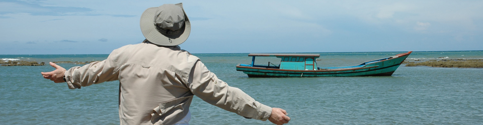
As a commercial photographer, I spend most of my time working creatively with businesses to visually represent their brand values through photographs for use in their websites and publicity material. Subjects range from business portraits, to illustrative shots and products of all sorts.
Now that we are again in pretty much a full lockdown, business is really limited to small scale product shoots that I can do at home but this also provides the opportunity to indulge in some local landscape photography – observing all the guidance, of course – and it makes a pleasant change.
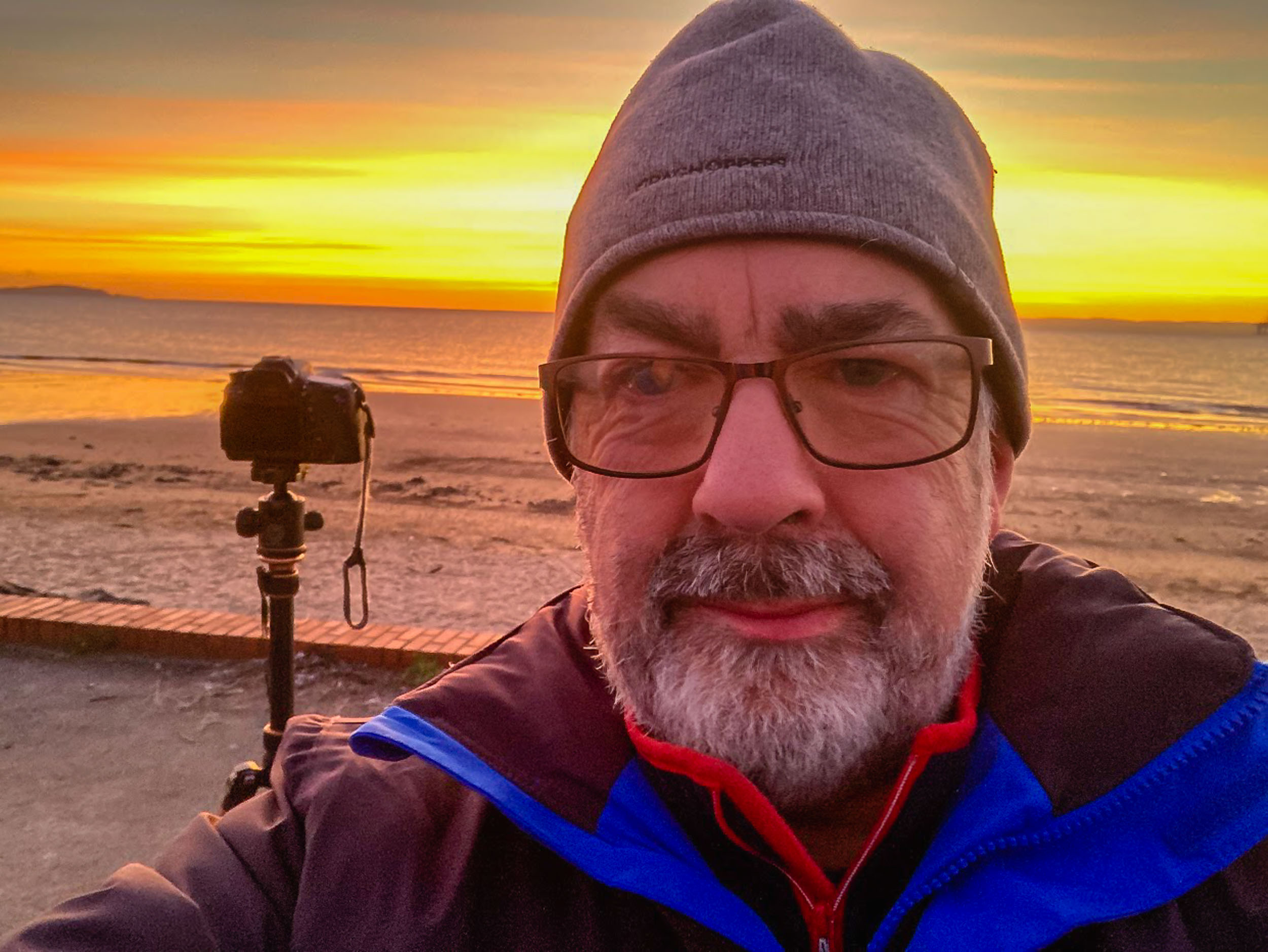
On Saturday morning I was up early(ish) to head to the beach with the aim of getting a photograph of the sun rising over the Firth of Forth. It was bitterly cold and one of the key pieces of equipment was the flask of freshly brewed coffee.
I had checked that sunrise was due at 08:45 and was at the location a good 30 minutes ahead of time. This gave me time to set up and also to take a few shots of the growing light before the sun rose over the horizon. The shot above was taken in this half hour before sunrise.
I’m not a landscape specialist but I think this is a genre every photographer enjoys, even if only for fun.
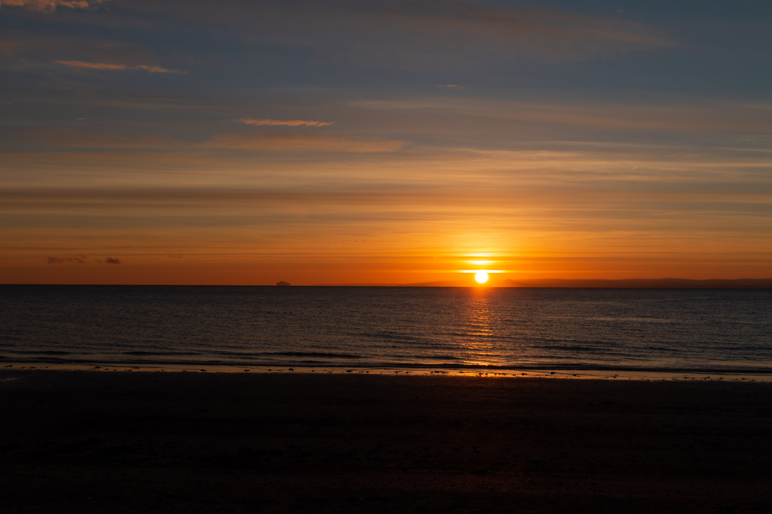
I set up on a tripod so that I had a fixed view which might allow for an interesting series as the sun rose. I opted for using aperture priority on ISO 100 setting the aperture to f11. I took a total of 32 shots in the set and the following is my favourite of the full disc of the sun being over the horizon.
This particular shot was at an exposure time of 1/125 sec. I had considered using an ND filter to achieve a long exposure and soften the water but decided against this for three reasons:
I think long exposures work best when there is a clearly defined solid subject in the frame
The time of the exposure would result in a tracking effect on the sun (unless I did a blending job in Photoshop)
My hands were cold and I couldn’t be bothered fiddling about with filters
In the end, I prefer that there is some detail in the waves which I feel adds interest to the shot.
I doubt this would win any prizes in a landscapes competition, but that’s not the point. It was a refreshing experience to step into a different genre and I got a lot of pleasure from taking the photo and working differently. I also happen to like the end result, which is a bonus.
I should say there’s minimal post-production work on this photo. It was all done in Lightroom and consisted mostly of lens correction, and slight tonal adjustments.
It was indeed a pleasant change, and something I plan to do more of.
Almost every photographer I know, whatever genre they work in, will say that they enjoy doing landscape photography. I’m a commercial photographer so I spend a lot of time doing everything from head shots (or business portraits, as I prefer to call them), to products, services, interiors and much in between. Most of this is done indoors with artificial lighting.
It’s therefore a joy to get out in the fresh air from time to time to indulge in some landscape photography, working with the natural environment and available light. It makes you think differently and engage in a fresh way with subject, light and equipment.
I’m also fortunate to live in Scotland where you are never too far from wild countryside and blessed with so many visual delights.
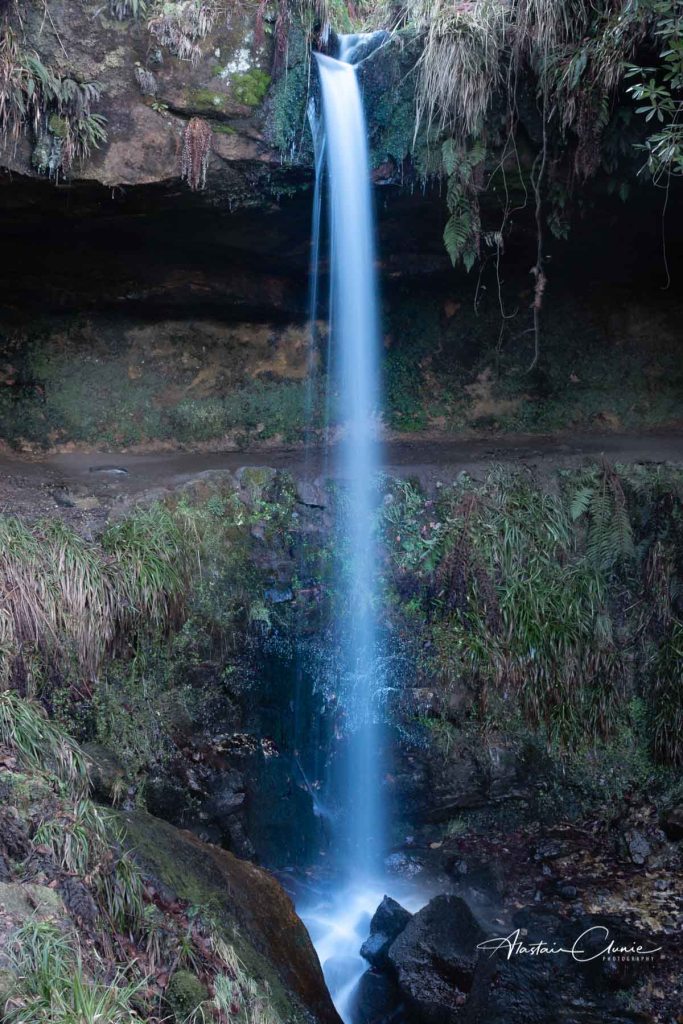
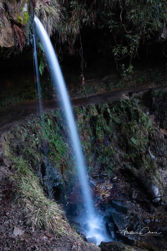
Here are a couple of shots, from a location not too far from my home in Fife. This is the Yad waterfall in Maspie Den on the Falkland Estate. I’m grateful to my business associates at Fife Networking, and especially Craig Allan, for encouraging me to post the photos after mentioning Maspie Den in a Zoom meeting this morning. Thanks folks!
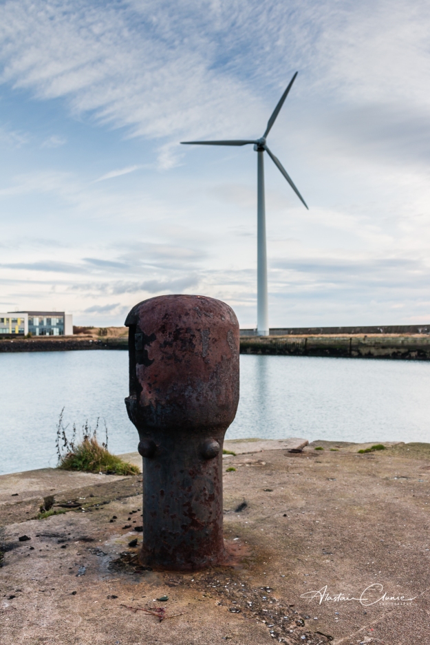
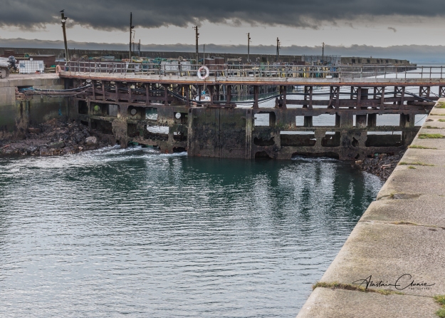
Isn’t it always the case that the things on your dooorstep are the things you tend to ignore? I decided to rectify that so made a visit to Methil Docks to see what I could photograph there.
I was struck by two things which are reflected in the two photographs here. Firstly there is evidence of changing technology reflecting the changing times.
After World War One, Methil was Scotland’s chief coal port which by 1923 was said to be exporting over 3,000,000 tons per year. The main colliery supplying the docks was the Wellesley which was located on a site virtually adjacent to the docks.
The colleries in Fife all disappeared a number of years ago as coal reserves were exhausted or became too costly to mine. Now, of course, the burning of fossil fuels has been shown to be a key factor in climate change. Now Methil Docks is home to Fife Energy Park which focuses on renewable energy as evidenced by the wind turbine.
It’s good to see this change in emphasis from a location which once was so key to the coal industry.
The second thing I was stuck by was the sense of industrial decay as seen in the old dock gates. Sights like this always make me think of the people who once worked there as I wonder what their lives were like. There’s a tinge of sadness at what once was but that’s balanced by seeing something new emerging and that always leaves a sense of hope for the future.
It was a day I just needed to get out with the camera to do some landscape work. It was cold and breezy as I scouted around looking for something inspiring and I reached the point of thinking that even if I didn’t come back with a shot, at least I was enjoying some fresh air and feeling invigorated.
I ended up back at a favourite location at Elie in the East Neuk of Fife and I wondered if I might get something slightly different this time. I’ve photographed Lady Anstruther’s Tower several times and on this occasion, it didn’t look all that inspiring but I was determined to try to find something a little different. Then I spotted a piece of ground which looked tailor made as a point to shoot from. This being December in Scotland, the sun never gets all that high in the sky and its low position here was casting an interesting light onto the tower and showing a clear line where the shore dropped into shadow. The water was relatively calm with only small wind-generated waves out in the Firth of Forth and the clouds were also fairly slow moving. I thought that a long exposure in these conditions would deliver just enough softening to the sea and sky to contrast with the hardness of the stone tower and rock promontory.
So, with fingers nipping in the cold breeze, I set up the tripod, popped on the camera, framed the shot and took an exposure reading before then locking off the focus and popping on a ten-stop ND filter.
After adjusting for the filter, the exposure settings were:
79 seconds at f22 with an ISO of 100. With a long exposure I tend to go for a narrow aperture which, especially with a landscape, increases the depth of field and is also a little bit of a safeguard should the focus slip slightly during set-up or exposure. I keep the ISO as low as I can to minimise any noise.
With regard to processing, everything was done in Lightroom. As always, I apply lens corrections and remove chromatic aberrations. I also ensured that the horizon was straight, though I try to make sure of this in camera, especially when using a tripod.
I then gave this a little bit of an HDR treatment by massively reducing the highlights and boosting the shadows I added some clarity and vibrance to help with the colouring and gently tweaked the white balance. I also made some gentle tone curve adjustments which gave the image a slightly richer feeling. All of that meant a slight increase in overall exposure by just under half a stop. Finally I sharpened but increased the masking so that pretty much only the edges were being sharpened. I pulled the radius down to 0.5 and left the detail at 25. The logo was applied as part of the export settings.
In the end, I quite like the overall effect of the contrast between the softened sky and water with the hardness of the tower and rock. I also like the alignment of two windows in the tower providing a clear view through which, for me, adds to the overall composition and was something I wanted to achieve so I had to find just the right spot on the small piece of ground I had to work with.
As much as I enjoyed the fresh air and the walk, it was good to come back with a shot I’m happy with.
I thought it might be of interest to pick one of my favourite images and explain what it means to me as well as something about how I created it.
Firstly, the title. I called this Scottish montage mainly because it is composed of elements that are distinctly Scottish. I don’t often do composites mainly because I can find myself constantly working on them and never getting to a point that I’m happy with. When they work though, as this one does for me, I find all the effort and tinkering worthwhile.
This image feels very Scottish to me and speaks of some of the things about Scotland that are very important to me. So, let’s take it apart and, in doing that, I will try to explain why it means so much to me.
There are four key images blended here to create the overall composite.
Background: This is Leven beach. Leven happens to be where I first lived and where I have now returned. Interestingly the shot was taken some years before the prospect of returning to Fife, let alone Leven, was even a vague idea. It therefore speaks to me of home but perhaps more importantly, it reminds me of the wide-open spaces of Scotland. Apart from the border with England, Scotland is surrounded by the sea and includes many islands so this also reminds me of the fishing heritage and that from these shores, throughout generations past, Scots have gone all over the world making a mostly positive impact. Although we feel attached to home, we Scots are instinctively curious and prone to exploration. The open spaces of Scotland appeal to me, so much more than the busy haste of city life, offering a sense of freedom and refreshment. Filling my lungs with either the sea breeze of the coast or the chill air of the mountains is simply exhilarating and life giving.
The overall image was built in Photoshop and the background is an unedited layer within the composite.
Foreground subject: This is a small sculpture found in Balbirnie Park at Markinch. It’s in the shape of a Celtic knot. In fact, it’s only the upper part of the sculpture and it is in the form of the Trinity Knot or Triquetra. The points on this three-fold knot are said to represent the Holy Trinity of the Father, Son & Holy Spirit but this can’t be verified as historically accurate. Most information relating to Celtic knots is dated after 450 A.D when Christian influence on the Celtic civilization began to take hold and these knots are complete loops with no start or finish and are generally said to represent eternity be that in the form of loyalty, faith, friendship or love.
The strong feature of the knot sculpture in the image reminds me of the deep cultural heritage of Scotland and of important values throughout Scottish history. We’ve always tended towards community as a people and been ready to welcome the stranger to our land. It also reminds me of the historical importance of faith in Scottish life.
The sculpture is a separate level in Photoshop. Because the sculpture itself is a consistent colour and has clear edges it was an easy job to cut it out from the background of its original photo and leave it on a transparent background. That was then placed above the background layer and I applied a mask to it. Working on the layer mask I was able to fade out the lower section of the sculpture to render it as a “faded shadow” which when added to the background makes it look like it is sitting on the sand.
Writing: The writing is from a photograph of a sculpture in the Scottish Parliament building called Travelling the Distance by Shauna McMullan. It features quotes from various women commenting on other women. The extracts shown in the composite are:
• Selected on merit, she ended 450 years of an exclusively male High Court Bench. (Alison Closs on Hazel Cosgrove)
• Best of Scotswomen, lifelong socialist, pacifist, grassroots activist, modest, eternally open-minded, an ordinary, extraordinary mother. (Liz Lochhead on Helen Kay)
• A wee lady always loving caring, determined, and generous, devoted to her faith and family. (Morag Ross on Elizabeth Dyce & Jean Campbell)
• Her passion for equalities shines through in her voice and in her eyes. (Ruth Black on Irene Graham)
• Thanks to Scottish Women who made the difference. Always stay on the equality path (Jane McKay)
• She makes me continue to believe that the fight for a more just world is the right road to be on…. (Elaine C. Smith on Helena Kennedy)
• When her friends visited, you never knew whether to bring out the silver or lock it away. (Hilda Smith on Chris Grieve)
This element of the composite reminds me of the number of strong and influential women in Scottish history and in Scottish life. So much to be appreciated and valued.
The words are another layer in Photoshop. The layer is simply the original photograph of the sculpture but I reduced the layer opacity to 60% which diminished the background enough to allow the writing to stand clear and retain something of the natural shadow from the writing which is in relief on the sculpture.
Trees: This is the final image layer and it’s a rather more subtle one. Just above the centre of the image and to the left of the sculpture there is what appears to be some trees on a hillside. In fact, these are the branches of one tree. More on that shortly.
I included the trees to remind me that Scotland is not barren across its wilderness spaces. The “trees” are there to remind me of the productivity of the land be that through nature’s provision or agriculture. I wanted the “trees” to be bare – winter plumage – as that worked better with the overall feel of the composite image and also reminds me of the fragility of things in these days of climate change awareness. It reminds me of the responsibility we have to the place we call home – from our own locality where we live, up through our countries to plant Earth itself.
The “trees” layer is, as I mentioned, one tree which I rotated through ninety degrees to make the bare branches appear as trees themselves with the trunk standing in for the ground. Fortunately, the background on the original tree photo is nice and clear so it was a simple job of positioning the layer as I wanted it in the final composition and then applying a layer mask and gently removing all that I didn’t need. Within the final composition it has the effect of creating the impression of a landscape beyond the water which I quite like, and I think works reasonably well.
In summary, this composite image reminds me of at least some of the things about Scotland and being Scottish that I hold dear.
While there are four images making up this composite, there are a total of eleven layers involved in creating the final image. In brief, and in order from bottom up, they are:
Background image – unaltered.
Celtic knot sculpture – transparent background and layer mask applied
Brightness/contrast adjustment layer
Trees – positionally adjusted and layer mask applied
Words – opacity reduced to 60%
Curves adjustment layer
Texture brush adjustment layer
Photo filter layer
Selective colour adjustment layer
Levels adjustment layer
Another Brightness/contrast adjustment layer
All of the adjustment layers were making individually minor and subtle changes, nothing heavy handed, so that the cumulative result is what I was happy with. It’s in those minor adjustments that you can get trapped in continual tweaking. I didn’t complete this work on one sitting. It took a good number of “visits” to work through interrupted with periods of leaving well alone. It’s an example of making sure you can see the wood for the trees!
This image is available to buy from my website as prints and wall products.
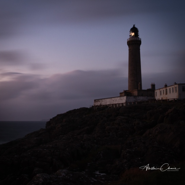
As the shroud of dusk envelopes the landscape as a portent of night, so Ardnamurchan Lighthouse springs into action protecting the sailors and their ships from the most westerly point on the British Mainland.
This is one from the archive and the metadata tells me the following:
The photo was taken at 19:51hrs on 24 September 2015. I’m not sure if that’s the moment the shutter opened or closed, because this was a 25 second exposure at f20. I shot at ISO 100 to minimise noise and quite wide at 26mm. All editing has been done in Lightroom, and mostly with a light touch. I opted for a sqaure crop as I will be using this across my social media, but I like the resultant composition, I also added a slight vignette to help draw the eye to the light.
As I said above, Ardnamurchan Lighhouse is at the most westerly point on the British mainland positioned at Latitude 56° 43.6′ N Longitude 6° 13.4′ W . It’s been been safely guiding ships through the waters off Scotland’s west coast since 1849 and is now fully automated. The lighthouse tower is 36 metres tall rising 55 metres above the rocks. It was built in 1849 using granite from the Isle of Mull and was designed by Alan Stevenson, uncle of Robert Louis Stevenson, whose family designed most of Scotland’s lighthouses over a period of 150 years. Apparently it is the only lighthouse in the world designed in an “Egyptian“ style.
One from the archive this week, taken on a filming trip to Afghanistan in December 2003 and a personal favourite.
This is in the capital city, Kabul. At the time of my visit it was strugling to find peace after years of conflict and was still in the early days of the UN forces presence. I remember the bombed-out buildings, bullet-holed walls everywhere and the total lack of any street lights.
I was impressed by the reslience of the Afghan people and this man typified it. I was told that he was a former wrestler and was famous in Afghanistan but had now lost his sight. In a country with no social security or welfare benefits you have to do what you can to simply survive. What this man had done was to create a room in his house and knock out an opening to the street. This was his shop and here he traded daily selling a variety of produce.
What I like about this image is the story it tells. Unless I had been told, I would have had no idea this man was blind. Here he was sitting in his home shop, enganing happily with a customer. There is an expression of welcome and engagement on his face and he appears relaxed and at peace with his lot. I like the scales sitting between him and his customers, speaking of balance, fairness and justice. It’s a symbol of hope for a nation plagued throughout its history by bloody conflict.
This was originally shot on film, Fuji 800 Pro if I remember correctly, and the resultant grain gives the image a certain mild grittiness which I think is appropriate.
It occurs to me now that this was almost 15 and a quarter years ago and I find myself wondering how this man’s story developed.
I admit it, I’ve not been all that diligent in recent times in posting on social media or writing a blog post. Life has been, and remains, busy.
What I’ve decided to do in order to rectify this omission is to post a “pic of the week” across all the social media I use and, on this blog, to make some comment on it. This is my promise to myself. The pictures might be something I’ve shot recently (even in that week) or something older from the archive. I feel this is probably something I can sustain as a minimum and maybe on occasion I will be inspired to post more. I’ve set myself a recurring ask reminder, so all being well…
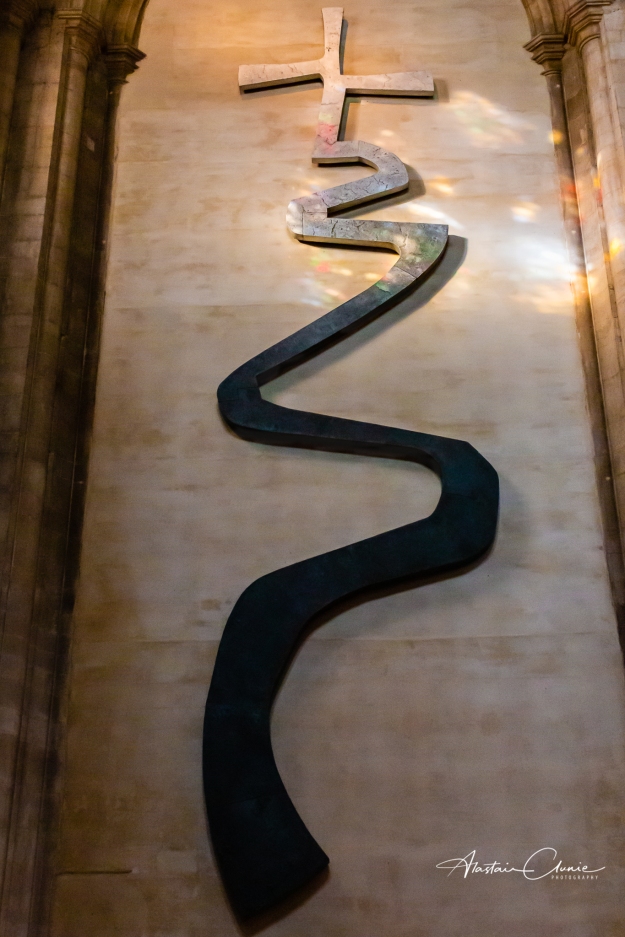
And so we begin with this one, a sculpture on the wall at Ely Cathedral in Cambridgeshire. I shot this a few weeks back and this one’s for Easter.
The sculpture simply hangs there in the cathedral with no comment, allowing people to interact with it as they will. And that’s how I’ll leave it here. Just engage in the conversation by looking at the photo and allowing it to communicate.
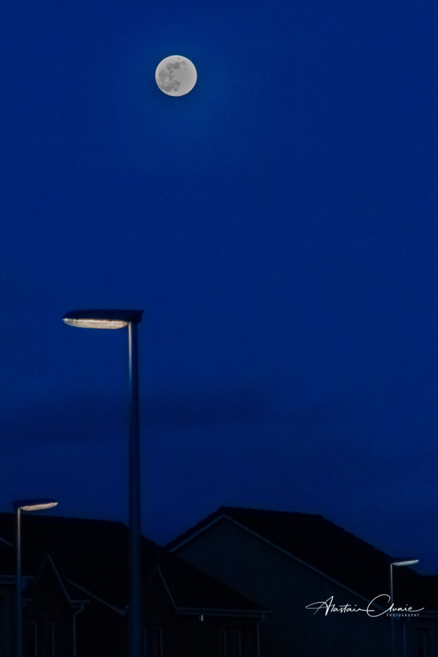
This is the final supermoon of 2019 hovering over the neighbourhood and coinciding with the spring equinox. It’s the last of this year’s three back-to-back supermoons, the first occurring on Jan.21, and the second, which was the biggest and brightest, on Feb 19.
Fortunately we had clear skies so I simply had to grab the moment to get out and take the shot – barely an hour before writing this! I must admit it was opportunistic as I hadn’t been aware this supermoon was due. I had simply gone out to take some rubbish to the bin and was met by this glorious sight.
So, I headed straight back inside to get the camera, change the lens and do my best to get a decent shot. There was no time to faff around setting up a tripod, which is fine (and best) when you are planned and ready but this was sheer opportunism so how do you go about trying to ensure you get the shot? Well, here’s what I did.
The lens I had on the camera was a 55 – 200mm with no image stabilisation. I needed to work hand held but minimise blur from camera shake. I opted for manual mode, and selected an exposure time of 1/500 sec. The rough rule of thumb is to use a shutter speed at least twice the value of the focal length of the lens. I was doubling it which more than compensated for the multiplier effect of my crop sensor of 1.6. I chose an aperture of f8 which is around the sweet spot of the lens and then put my ISO on auto. This would at least guarantee a decent exposure and I spot metered on the moon. The pay-off, of course, was going to be grain (or noise if you prefer, but I grew up with film so it’s grain for me!)
After taking a few shots to bracket exposures around my settings and to spread the shake risk a little I took the images into Lightroom. All of the processing of this shot was done in Lightroom. What I did was allow for lens correction and also chromatic abberation. Then I made some global (though slight) adjustments to the exposure and tweaked the white and black scales just a little. I also introduced a little contrast, then made local brush adjustments to the moon to bring out the detail and to the rooftops to prevent the blacks from clipping. I then set about sharpening using the mask to pick out only the edges and bringing the radius down to 0.5. I had to give it a fair bit of noise reduction on luminance with a heavy hand (nearly 100%) on the colour noise reduction.
In the end, I’m quite pleased with this shot which goes to show that you should never pass up an opportunity even if you’ve not planned and therefore think it won’t be the perfect shot. It’s always worth giving it a go.
I was browsing through my old files today and came across this photo of Lochnagar which I had taken on 28 May 2010. The original shot was somewhat “thin” but I felt it offered some prospect of redemption so I opened the develop module in Lightroom and set to work.
Here’s the before and after comparison:
Lochnagar – before and after
I felt that this image would benefit from some “thickening” of the colours and contrast and also that the sky could made just a little more dramatic.
Here then, is the story of how I used Lightroom to go from the original to the final image.
The first thing I always do is to Enable Lens corrections and tick for that. I also usually tick to Remove chromatic aberration. After that I make sure the image is straight and then it’s off to the Basic panel.
Basic panel
Usually, this is a light touch approach in here, but this image needed more intense responses to get it to how I wanted it to look. I didn’t work down this panel in sequence but started with the exposure which just needed to come down a little. My next stop was to adjust the whites and blacks, increasing the whites and reducing the blacks until the points where clipping began and adjusting to just short of the clipping point. This already made a big difference. Next stop was to adjust both Clarity and Dehaze, working with both pretty much in tandem until the balance between the two was producing the effect I was looking for, Both of these are adusted here much more than I would normally be happy with, but the image did need it. Both also affect contrast and after experimenting with that a little, I left that slider alone and moved on to the Tone curve.
Tone curve
Here, as you can see, I made very slight adjustments to the dark tones and highlights for a very gentle S curve. I need to emphasise that in processing photos I am not looking for specific settings values but judge the effect being made by eye. I constantly look at before/after comparisons to see how the work is progressing. Next up was a little work on the colour channels where I wanted to enhance the sunlight falling on the corries and flank. And so to the HSL panel.
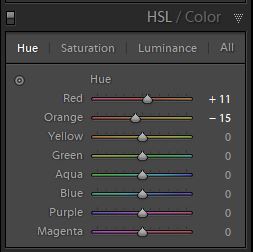
HSL panel
Here I felt I only needed to make slight adjustments to the red and orange channels where I pushed the hue on both a little more towards orange and then very slightly increased the saturation. Another check of the before/after comparison and I felt we were nearly there. The final destination was for some sharpening.
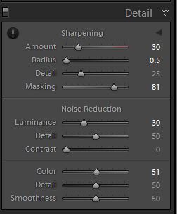
Detail pane
My approach here is to control the sharpening carefully. To do this I first apply just a little sharpening then holding down the Alt key inclrease the masking until I see only the white parts that I want to actually apply the sharpening to. For landscapes I tend also to reduce the radius to 0.5 and leave the detail as is. Again, holding down the Alt key for the black and white screen I adjust the Luminance to minimise grain (noise) to what I think is an acceptable level, The black and white screen allows this to be visualised more easily. This image also needed some colour noise reduction, probably as a result of the extent of the clarity and dehaze adjustments made earlier. Finally, I made a trip back to the Basic panel to cool the colour temperature just a tad. And that’s it.
It’s worthwhile revisiting old shots occasionally to see what’s there and what might be worth a little more editing work. It’s also good practice for the virtual darkroom.